 Lytra
Blending your playlists and albums into a mix for every activity, at your tempo
Founder, designer and sole engineer of an iOS music app.
Published by Franklin Labs: franklinlabs.app → (opens in a new tab)
- RoleFounder
- DurationSince August 2026
- OutcomeSubmitted to the App Store
The problem
Good music matters most when your hands are busy: mid-workout, behind the wheel, with people over. That's exactly when music apps ask for the most attention. Mid-run, you want songs at your pace, but most apps can't filter by BPM. With people over, you might want a few albums played start to finish, but you have to update the queue by hand, and any time the mood shifts you're reaching for your phone again.
What I learned before building
The idea started as something just for myself, for workouts and hikes. Then I saw how many other uses it had. In April I pitched it for my UX design class project. Nobody joined my team, so I shelved it and was forced to join a different group. In August I came back to it on my own. Before building a prototype I looked at what already existed. Streaming apps offer nothing beyond playing a playlist or album in order, or a traditional shuffle. Other apps use AI to pick songs for you, or, like most fitness apps, pick from their own catalog. None of them give you control over exactly how your music plays.
Deciding what to build
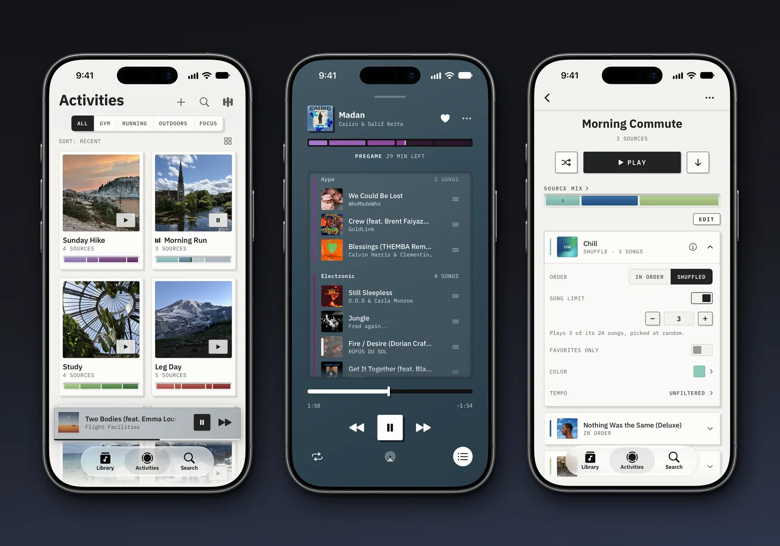
Lytra is built around one thing, activities, made up of your albums and playlists and specific rules for each. Pressing Play builds a fresh queue from the activity, sized to the time you pick.
Every other feature had to earn its spot by being something that reinforced the idea of activities made from your own music, meaning scrapping anything like recommendations and music insights. Doing so kept me out of competition with Apple and Spotify and let me focus on what makes activities better.
My original pitch in April had a lot more to it: groups of songs, subgroups inside those, and rules down to the single song. I cut all of it. Each one added friction. I wanted Lytra to feel familiar right from the get-go, so it keeps the features people already know and love from the big streaming services, with its own improvements and style on top.
Designing it
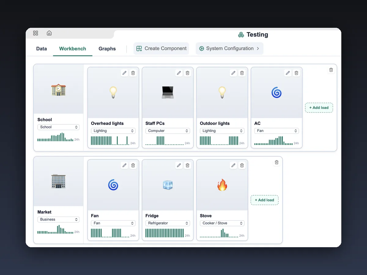
I borrowed the structure from the SESDC workbench: named parts that nest. An activity holds its sources, and each source opens to its own rules, all on one page.
I wanted Lytra to feel simple and smooth: no account creation and haptics where appropriate. Onboarding walks you through making your first activity, and the welcome screen and paywall are built on high-quality photos of people doing the activities Lytra is for. The interface is deliberately neutral so the album art, the artwork you pick, and the mix bar colors you set stand out.
Figma mockups
At launch
Building and shipping
I didn't stay in Figma long. Those two mockups were enough to settle the basic idea, and once I had that I went straight to a working prototype with Claude Code.
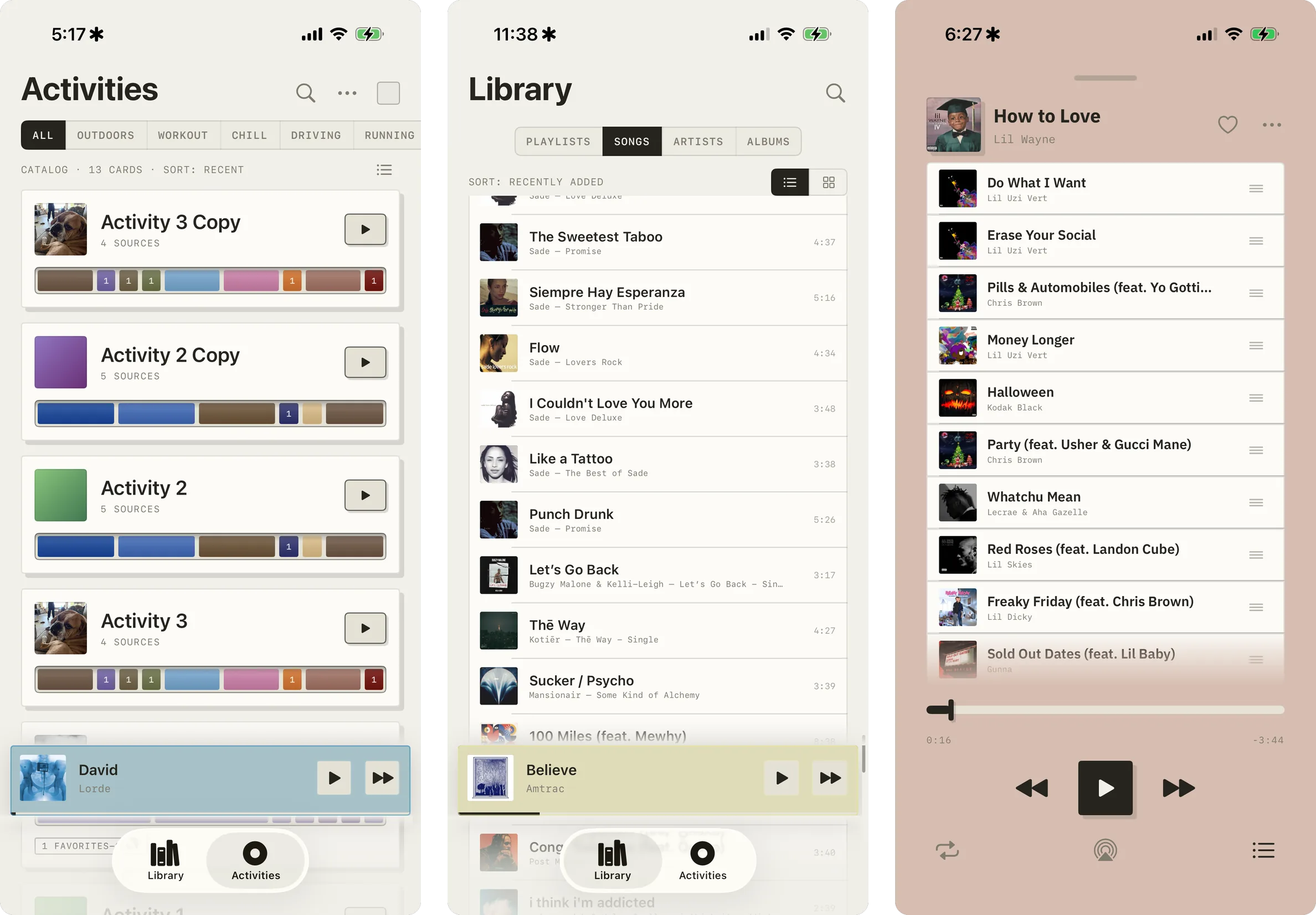
I used Claude Code to write the Swift. I owned the design decisions, the data model, and the queue-building logic, and reviewed everything it produced. The recurring problem was UX and UI inconsistency: screens that drifted from the design language in text sizes, spacing, and overall feel.
I used Lytra every day for what it was built for, workouts and hikes, and most of the requirements came from that. If something seemed off or could be better mid-workout, I noted it down and iterated on it once I got home. If I found myself not using a feature, it got removed.
What happened
Lytra is submitted to the App Store and, as of October 22, 2026, waiting for review. I've been using it every day personally.